Introduction: 
In my tenure at Resilience, I spearheaded the transformation of a print-centric, early startup brand into a dynamic design system, tailored for experts in industries where security and finance intertwine. This venture transcended aesthetics, demanding a strategic shift in perception for users accustomed to established design norms within sectors synonymous with cutting-edge security and financial prowess. 
A Human-Centered Approach:
Championing a user-first ethos, our journey began with in-depth user research. Through collaborative workshops, we engaged stakeholders associated with the unique aesthetic demands of security and finance industries. These sessions went beyond aesthetics, delving into the core needs and preferences of our users.

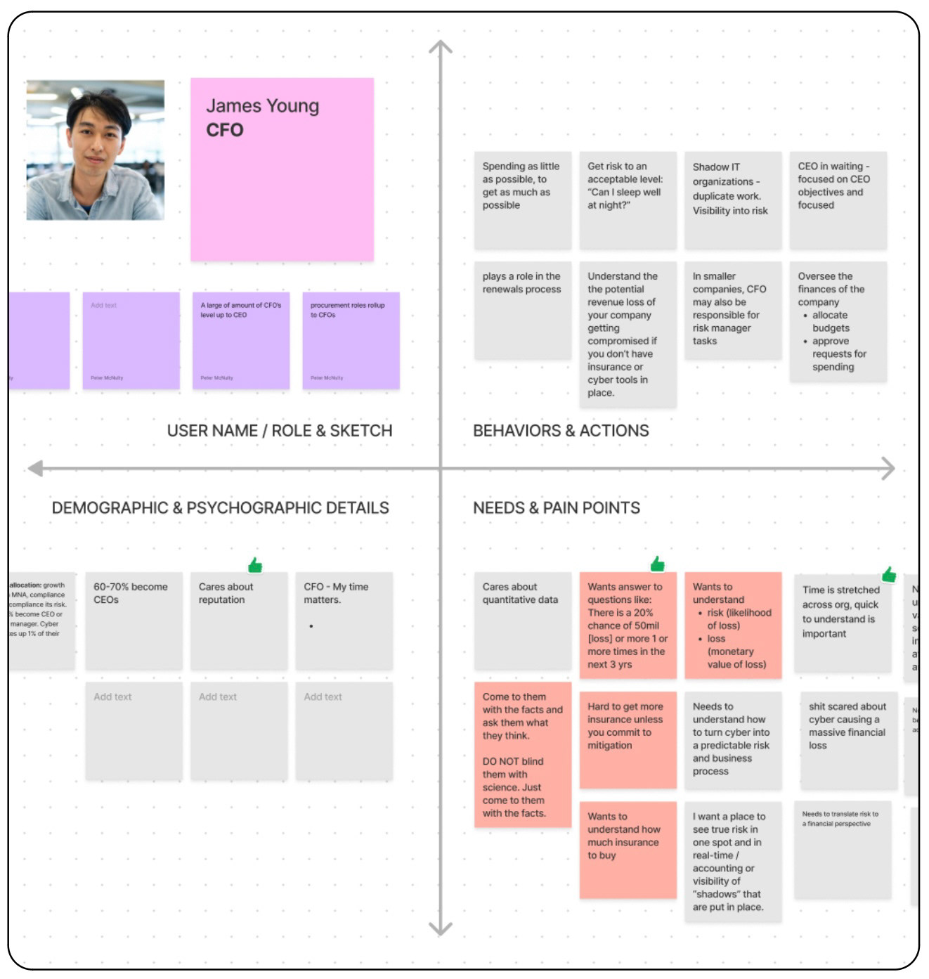
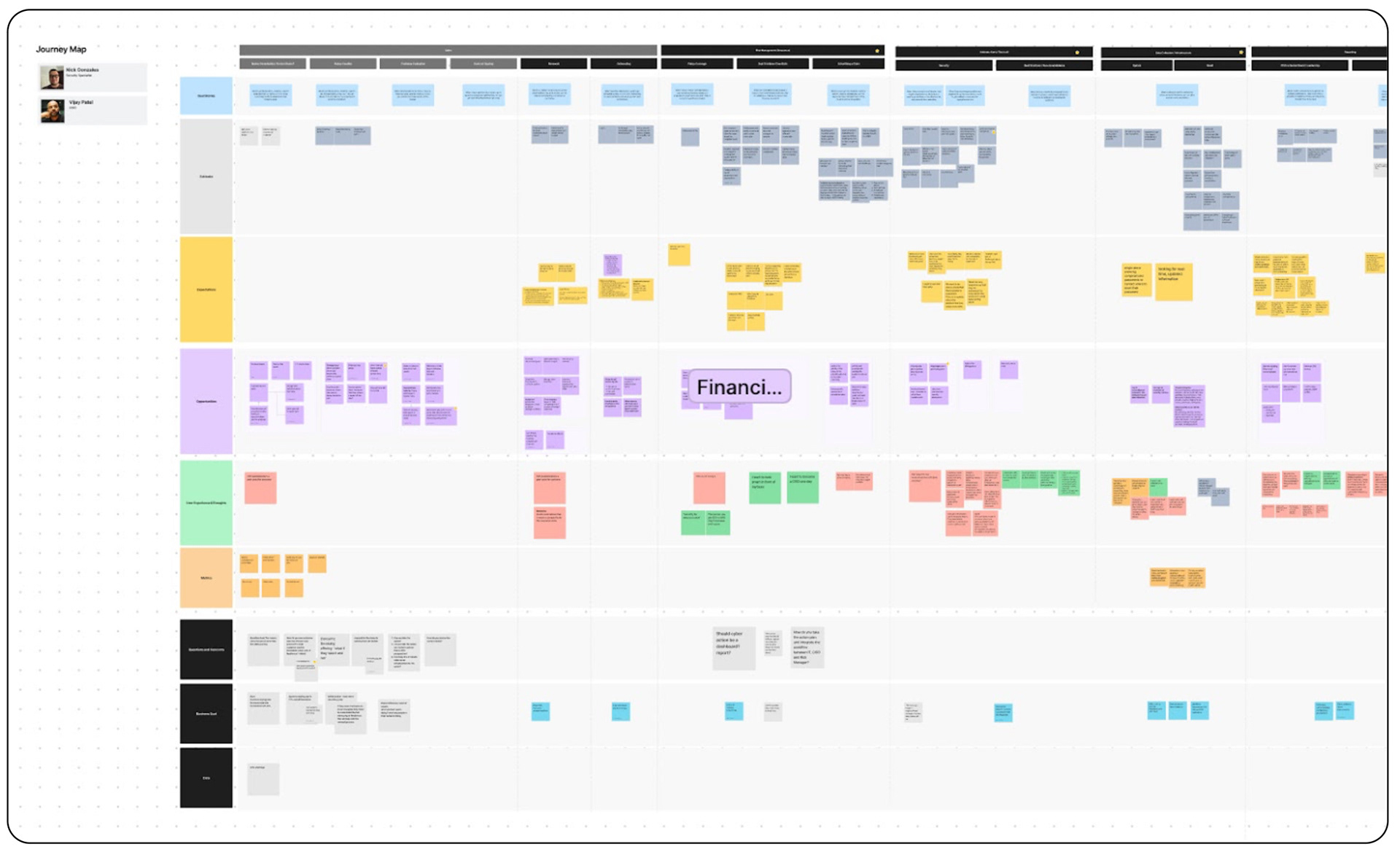
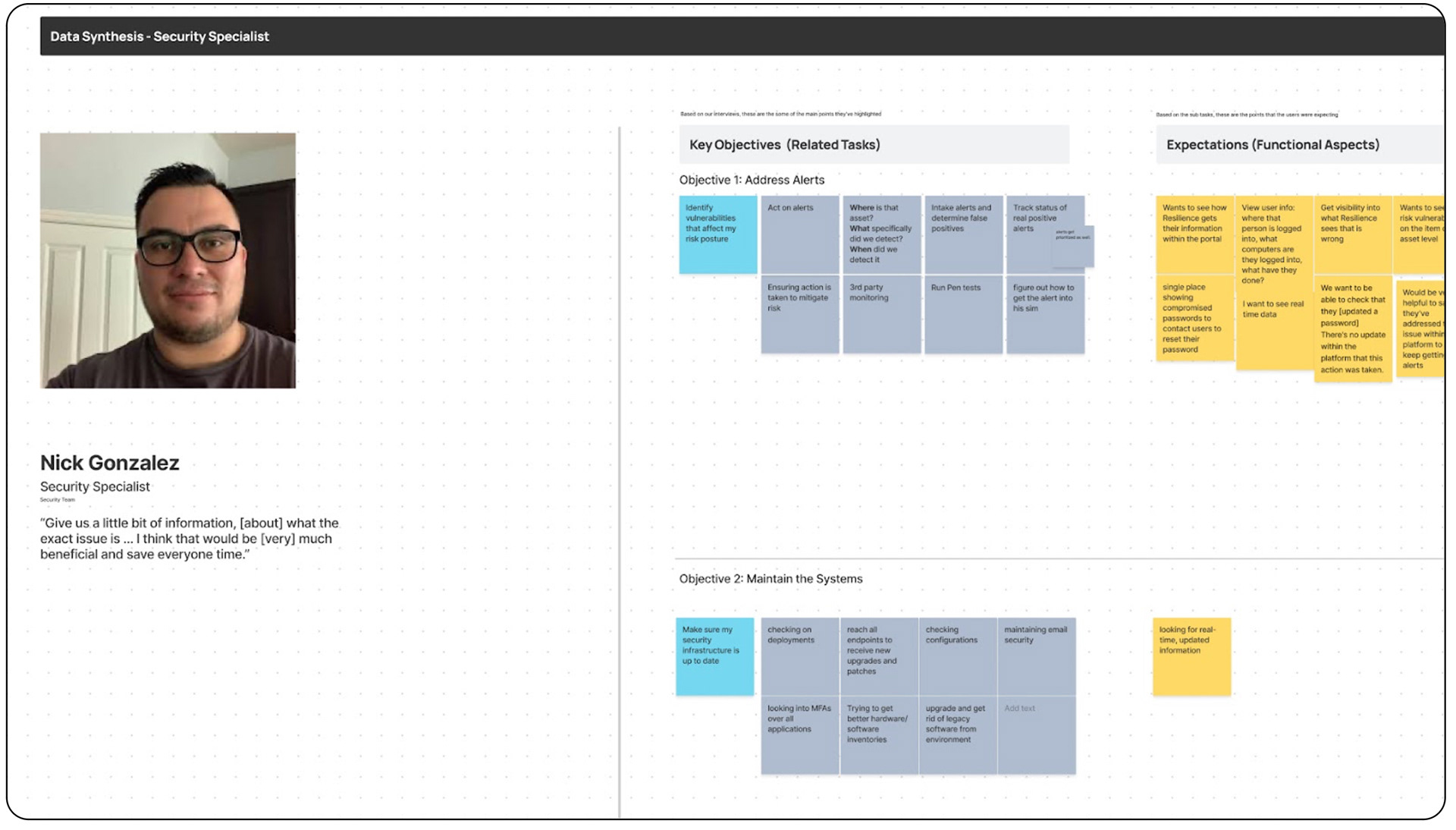
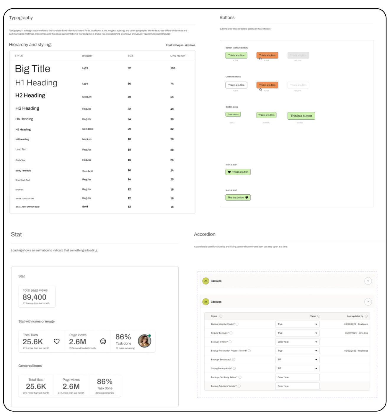
User research and collaborative workshops were pivotal in shaping our design choices, aligning them with the distinct needs and preferences of our target audience.
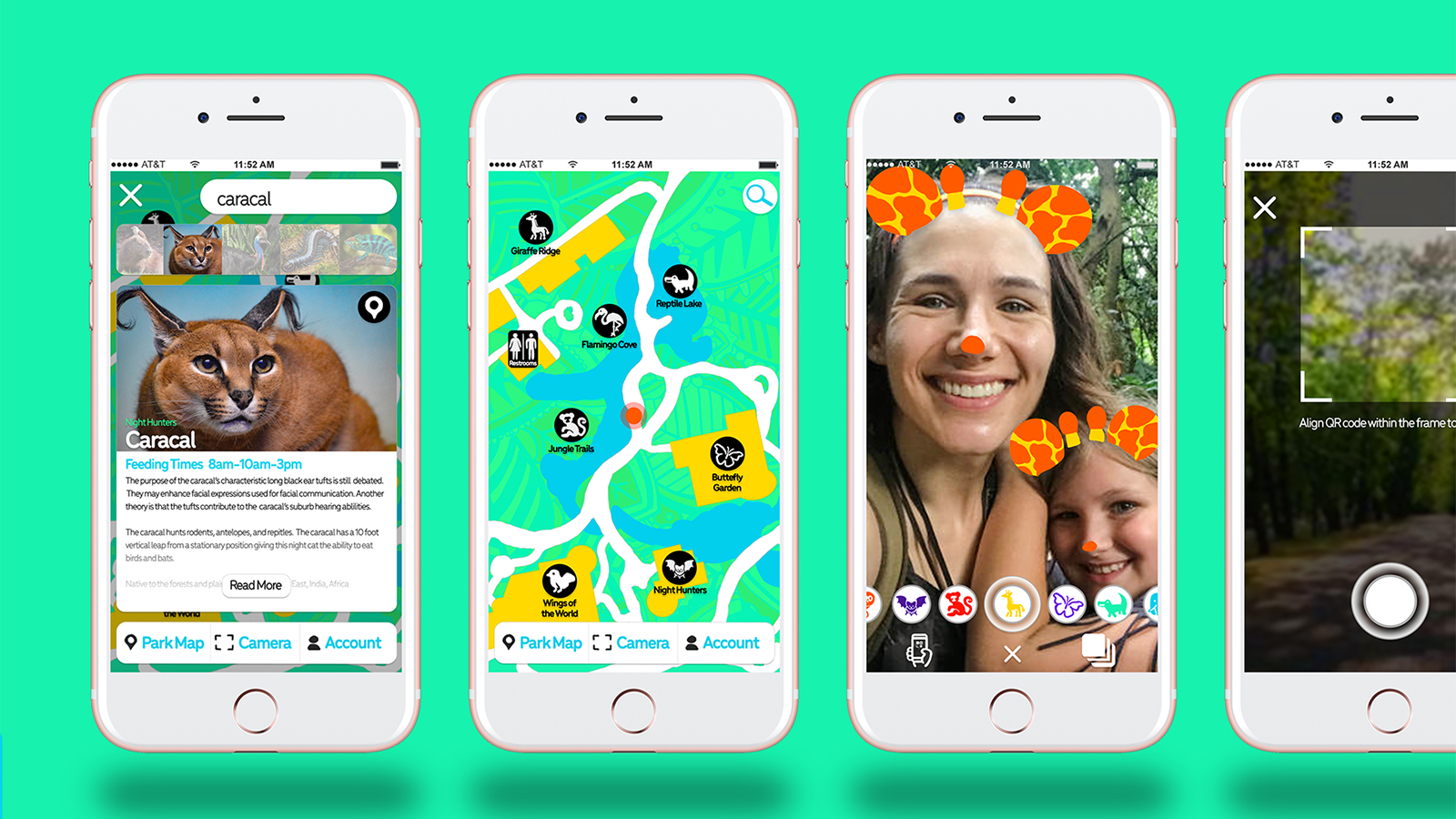
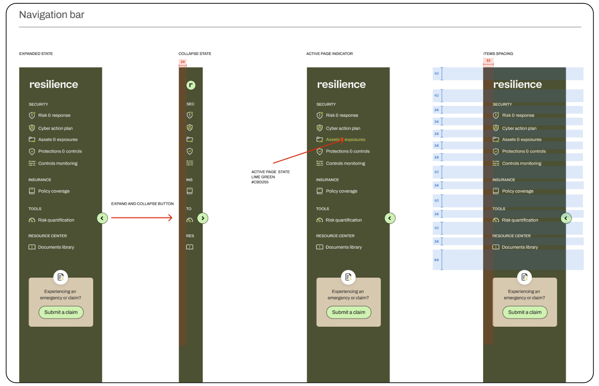
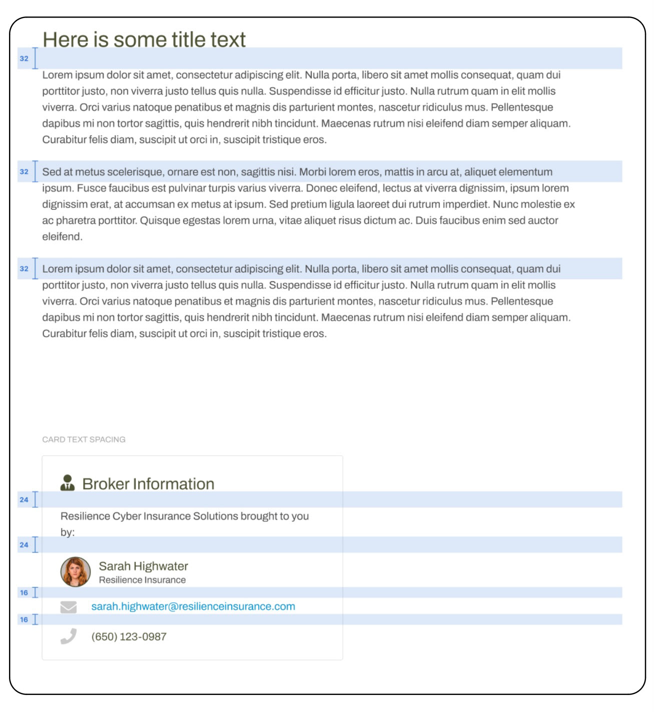
Setting the Stage: 
This transition wasn't just about visual appeal; it marked a fundamental shift for users entrenched in industries demanding the utmost in security and financial acumen. The goal was to craft products that seamlessly integrated into the toolkits of professionals in these high-stakes arenas, standing out in their own right.

Old Design System

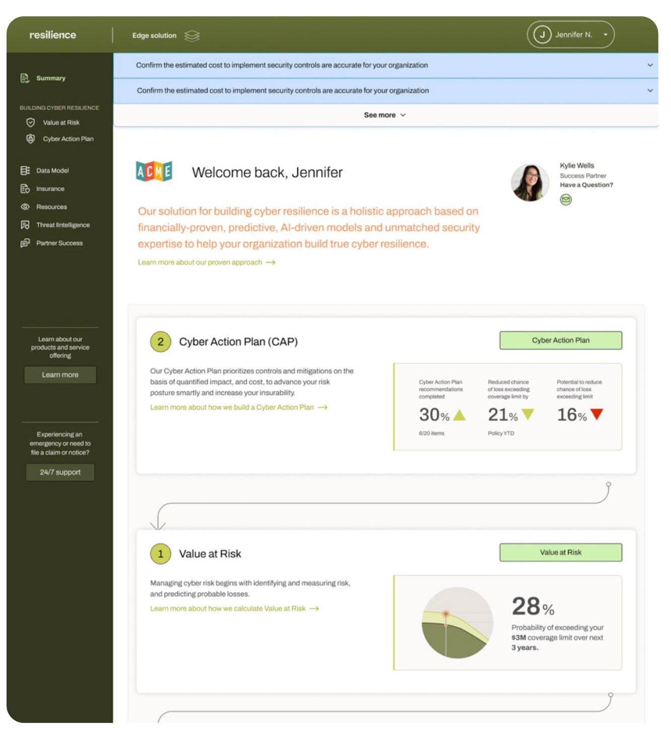
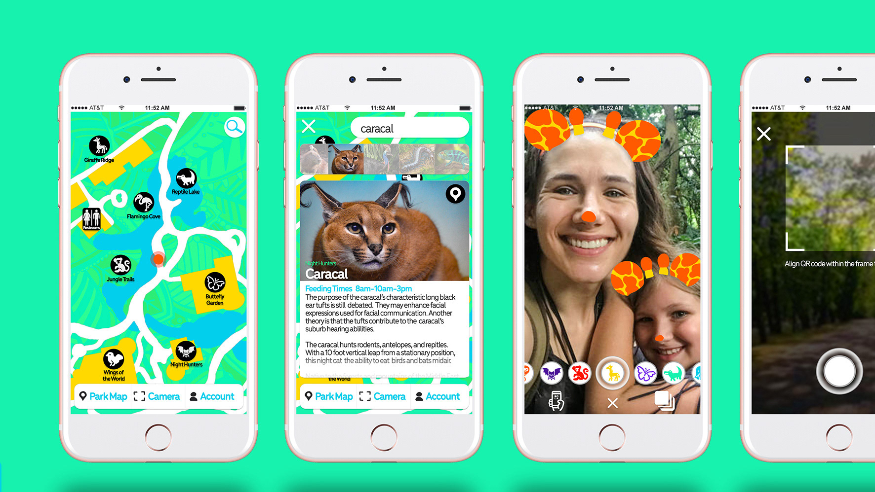
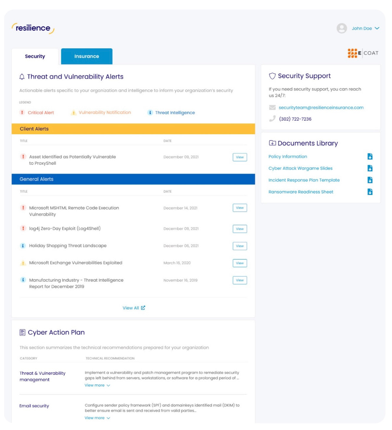
New Application in Product

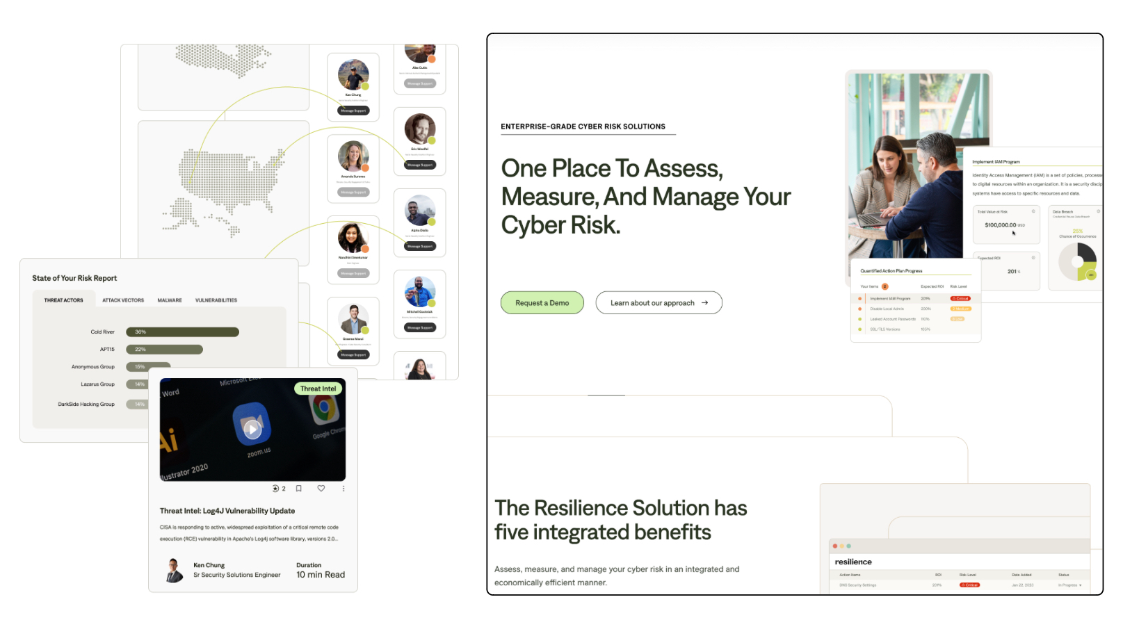
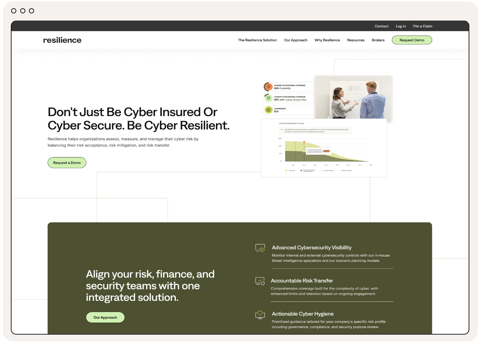
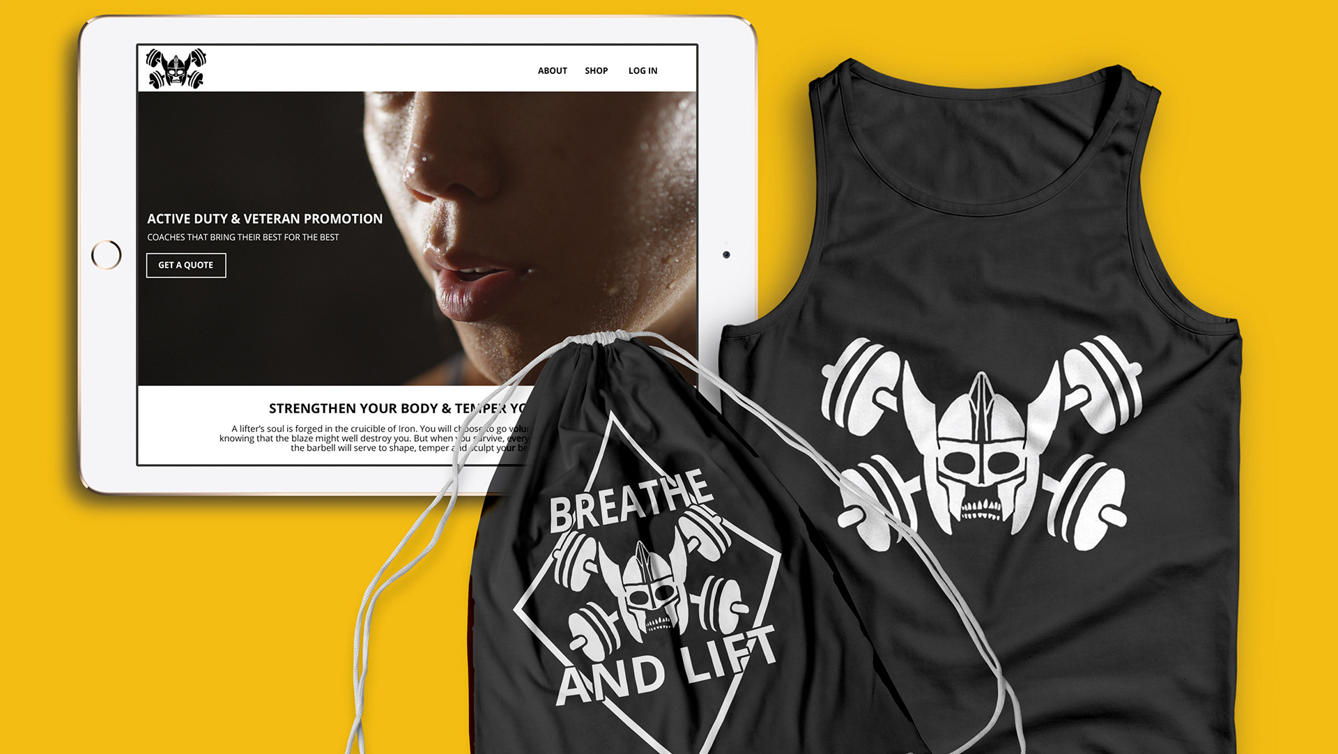
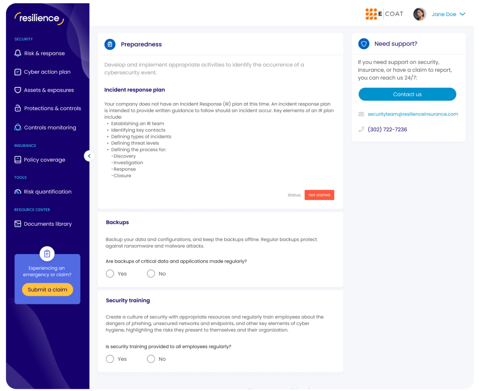
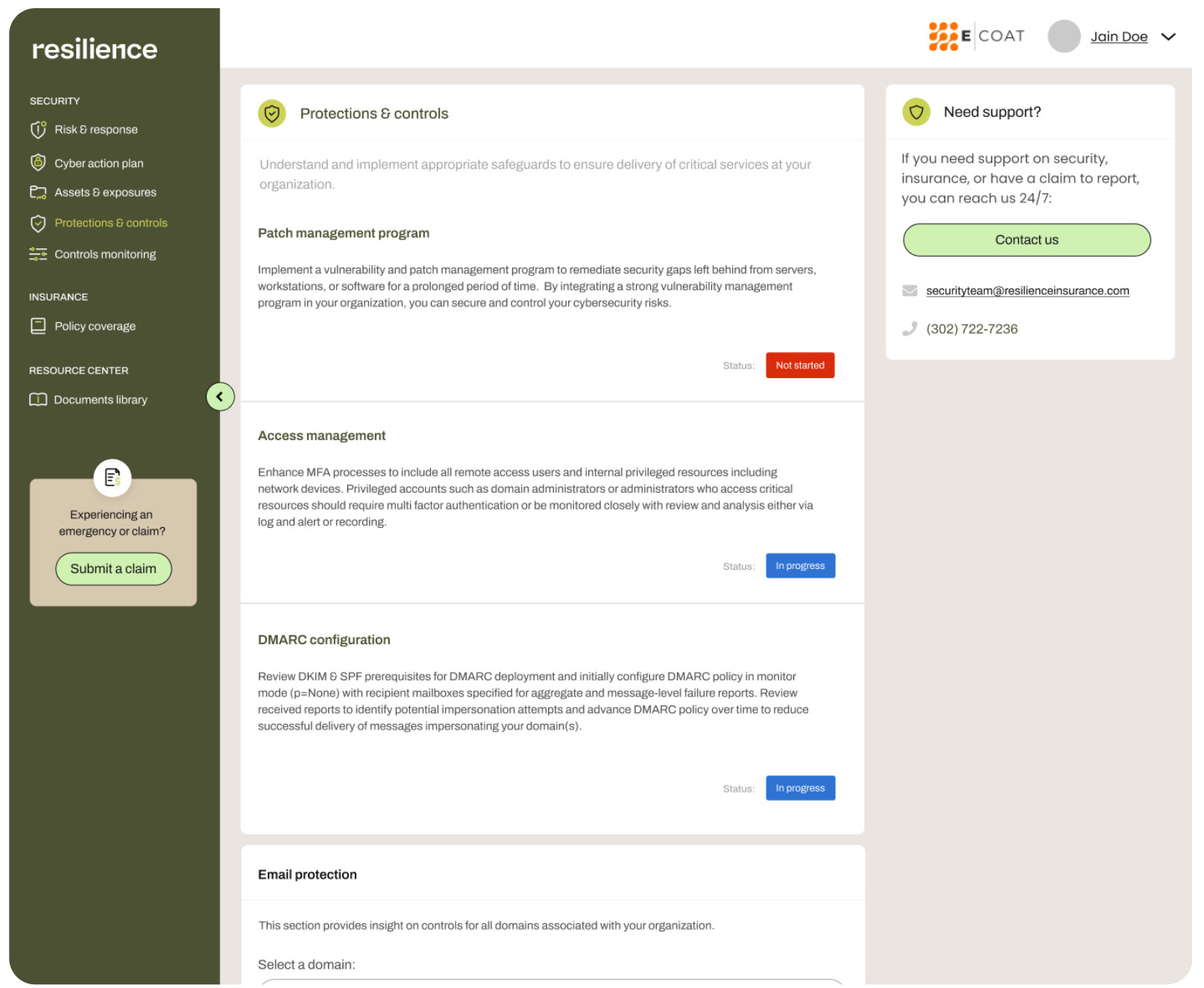
Transitioning from print-centric visuals to a dynamic design system marked a pivotal shift in user perception.

Building the Foundation: 
My central role involved crafting a design system that embraced this perceptual shift and addressed specific user-centric concerns. An illustrative challenge emerged concerning the color scheme. The initial brand featured a pristine white backdrop with a pure black font. Adjustments were made in response to issues like eye strain and reading retention, ensuring a design that resonated within industries that value precision and clarity.

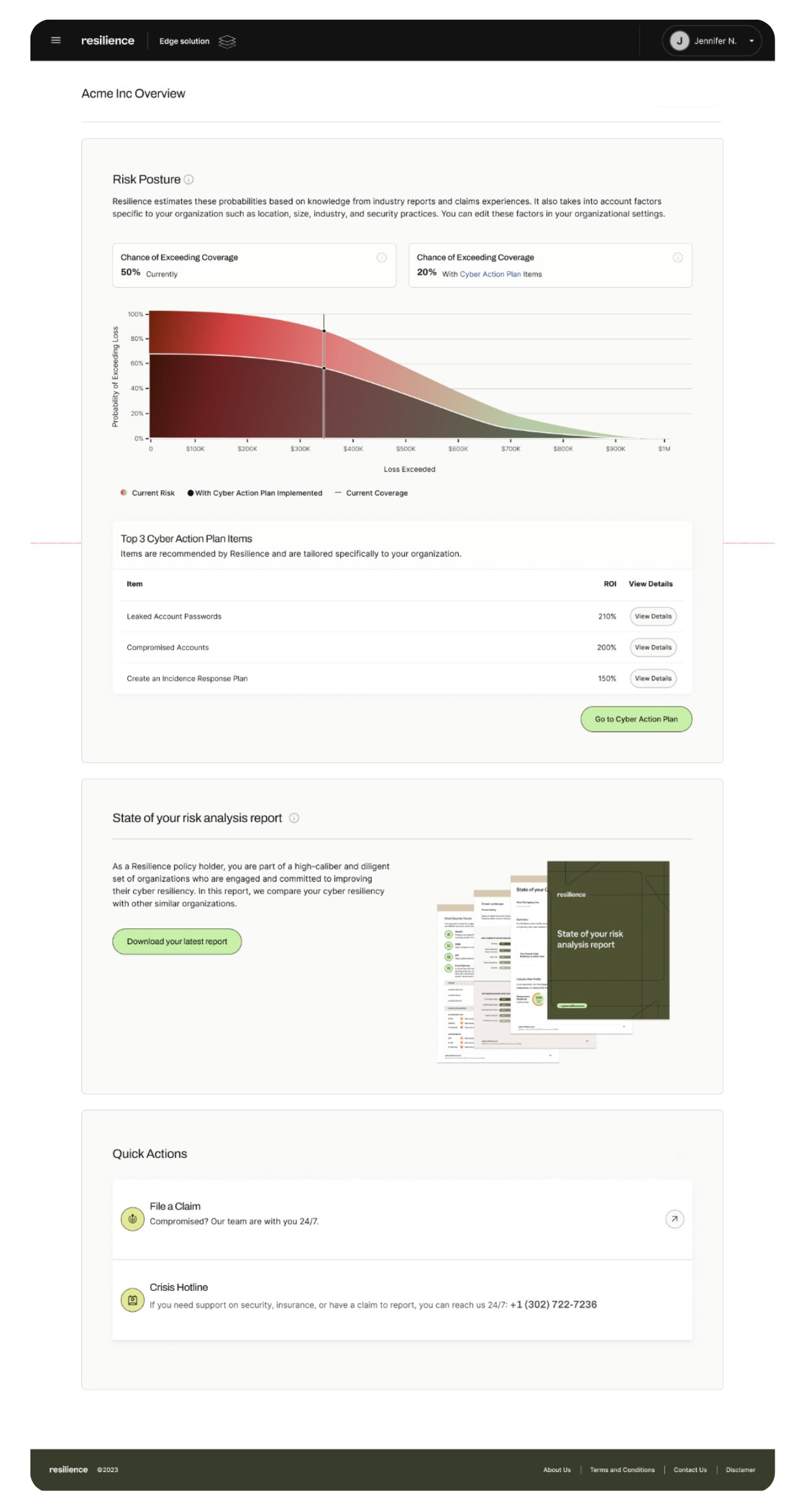
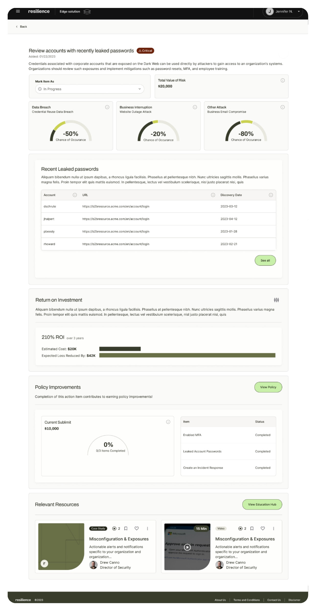
Navigating from a high-contrast palette to a harmonious scheme, our design choices improved readability, reduced eye strain, and significantly enhanced user engagement.

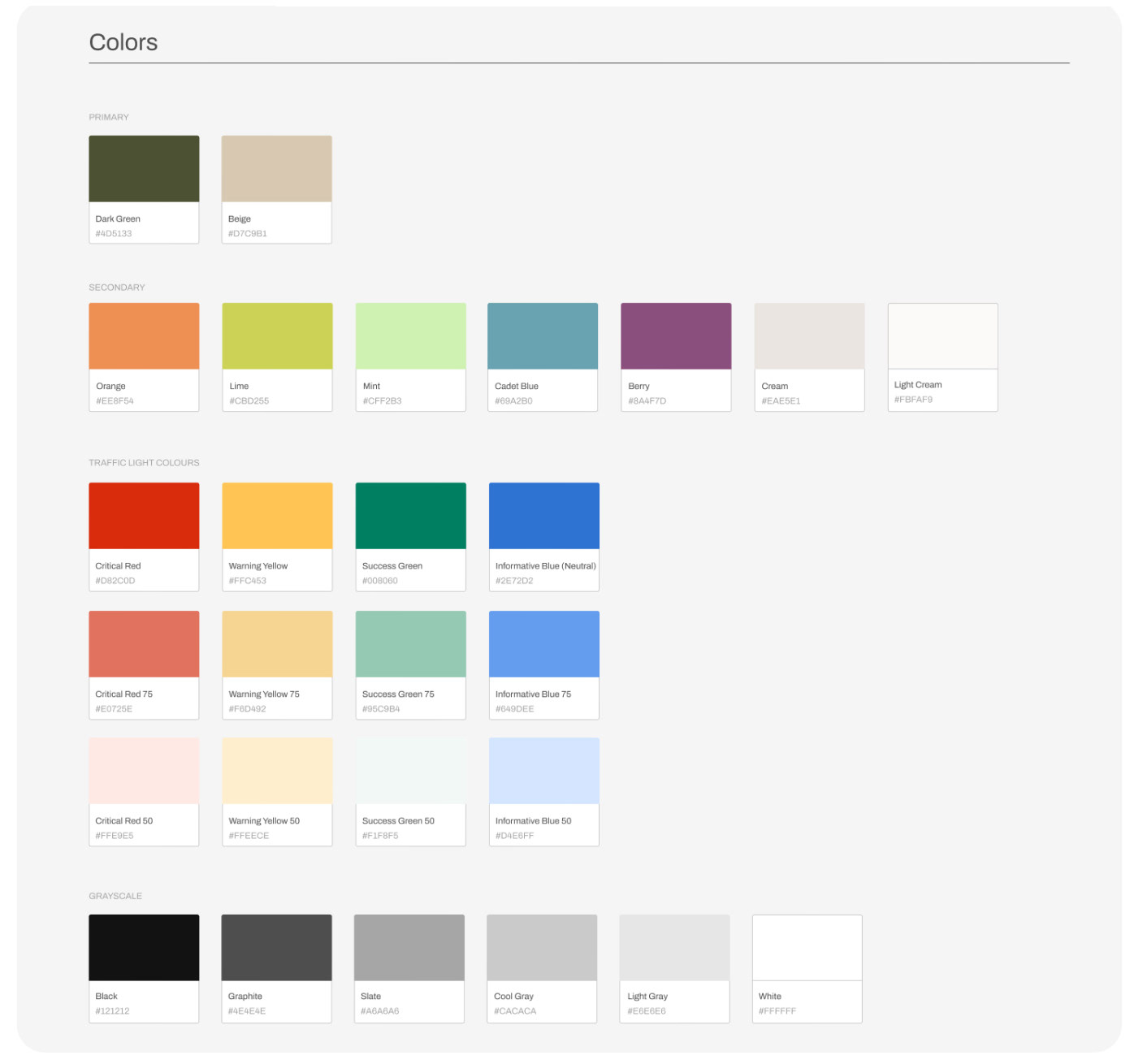
Old color system with pure black font on white.

New color system after an initial rebrand.

Component Library Overview:
Embarking on the design system journey involved meticulous curation of a robust component library. Here's a glimpse into the key elements that form the backbone of our design system:
Learnings and Growth:
In the early stages, we contemplated a tiered product strategy based on user types. However, insights from the mocking and wireframing stages revealed the paramount importance of transparency across teams. Adapting our approach, we found that providing all users with access to the same information not only fostered collaboration but also significantly improved the overall design.
Reflections and Learnings:
My design journey is characterized by a commitment to impactful change, whether transformative or incremental. From steering complete design system overhauls to influencing nuanced improvements, I believe every impact contributes to holistic growth. Collaboration across teams is ingrained in my philosophy, navigating challenges and fostering collective achievement. User advocacy extends beyond external stakeholders to our internal teams, ensuring a user-first approach in every design endeavor. This blend of impactful design, collaborative practices, and unwavering user advocacy positions me as a valuable asset in enhancing the field of design systems.

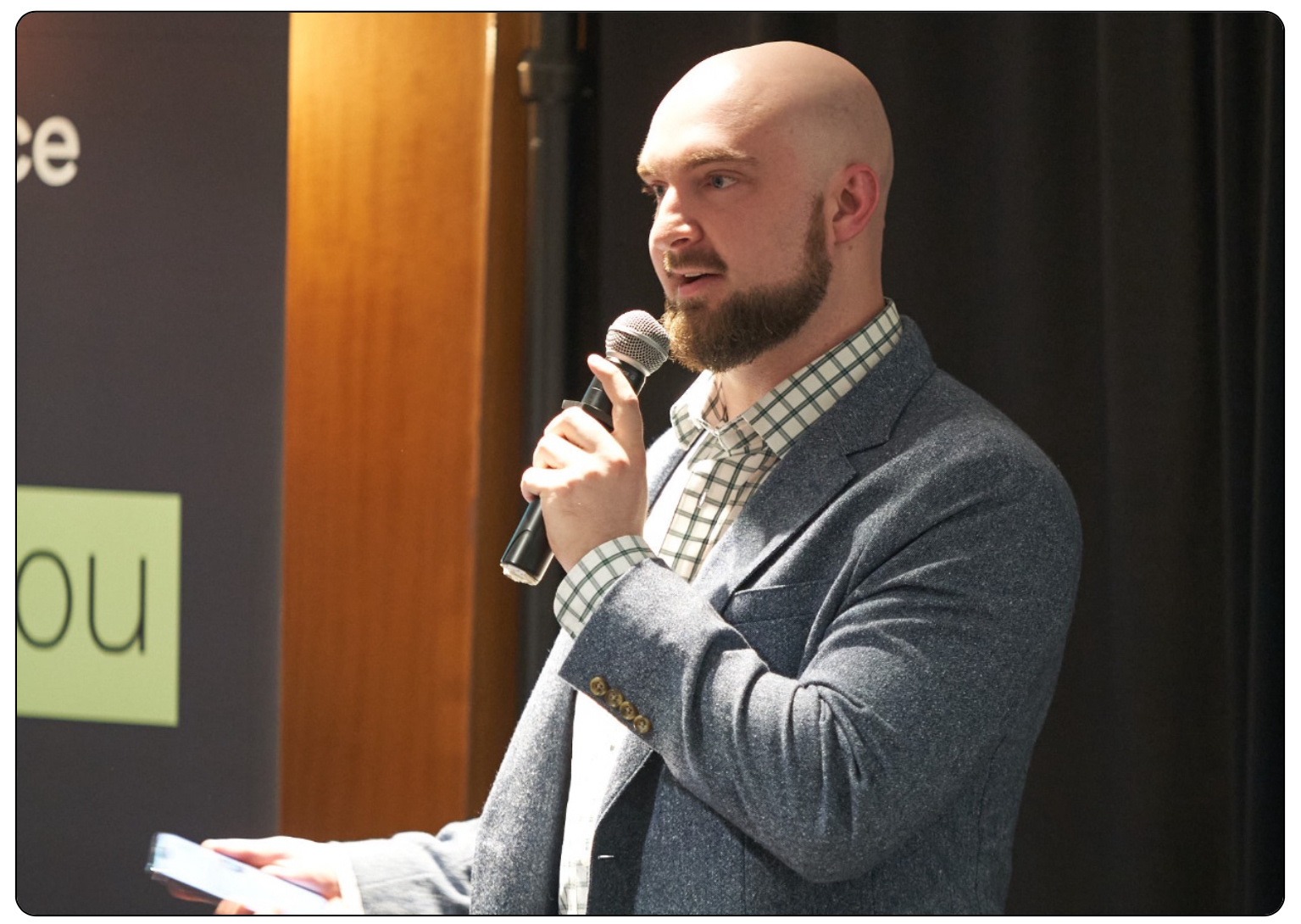
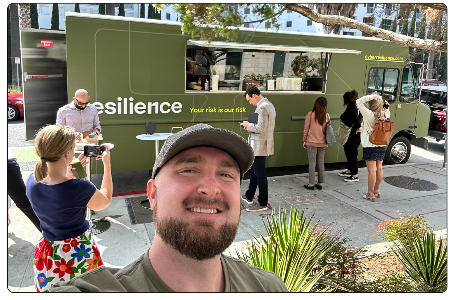
Presenting the culmination of our design system journey at Santa Monica NetD 2022. Sharing insights into the strategic launch of our design system's MVP, underscoring its impact on user experience and industry innovation.

You may also like

Back to Top